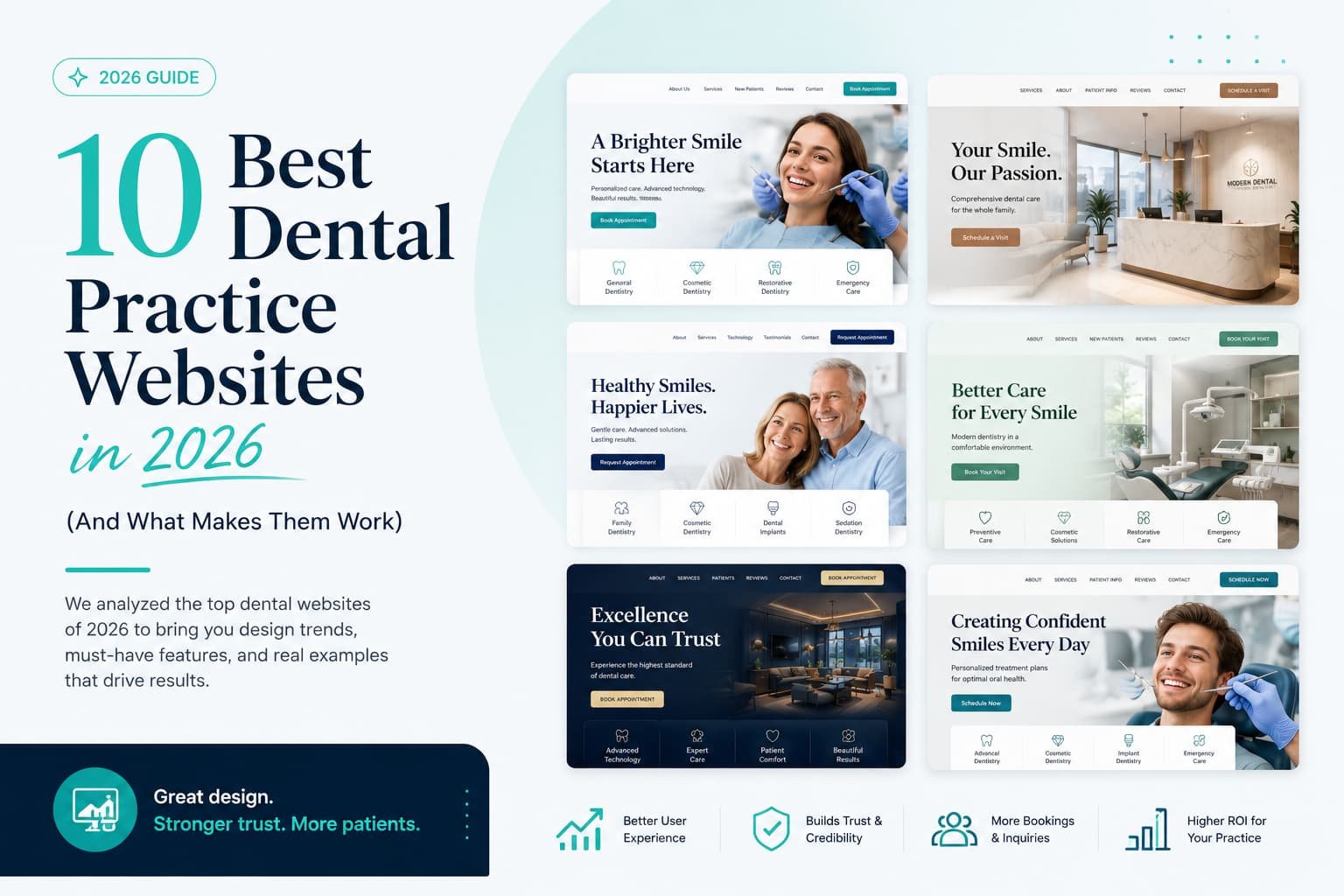
The best dental websites in 2026 don’t win on looks. They win by lowering a nervous patient’s guard fast: real reviews up front, a face they can put to the practice, straight answers on insurance, and booking that takes thirty seconds instead of a phone call during office hours. A gorgeous site that hides its reviews and makes you call to book will lose, every time, to a plainer one that puts an anxious patient at ease and lets them grab a Saturday-morning slot from the couch.
Most “best dental websites” roundups are beauty contests. Someone lines up ten pretty homepages, says “look how modern,” and calls it a day. We build and study dental websites for a living, and the sites that genuinely win new patients tend to get the same handful of small, human things right, the stuff that quietly answers a worried stranger’s questions before they even think to ask them. Below are the ten that matter most, based on patterns we see across the practices that actually convert.
A homepage that feels like being welcomed in

The best dental homepages greet you like a friendly front desk instead of a hospital intake form. Warm photography of the actual team, a headline that sounds like a person wrote it, plenty of breathing room instead of a wall of clinical stock imagery. Nothing on the page is shouting. It’s just reassuring.
That matters more in dentistry than almost anywhere else, because a good share of visitors are a little anxious before they even arrive. A homepage that lowers the temperature, soft, human, unhurried, earns the click to “book” from someone who was half-ready to close the tab. This isn’t about a color palette. It’s about tone.
The reviews are doing the talking
The strongest dental sites treat reviews as a design decision, not an afterthought. Nearly all patients read reviews before choosing a dentist, and a growing number won’t even contact a practice sitting below 4.5 stars. Instead of tucking testimonials onto a lonely Reviews tab, the best sites put real patient voices on the homepage and sprinkle them through the service pages, complete with names and specifics.
Specificity is the whole game. “Great service” is wallpaper. “I hadn’t seen a dentist in six years because I was terrified, and they made it completely painless” is a sentence that books an appointment. The strongest sites choose reviews that tell a story, not just the ones with five stars.
The dentist you feel like you already know
This one’s simple and criminally underused: a short video of the dentist, right on the homepage, just talking. Who they are, why they do this work, what a first visit is like. Sixty to ninety seconds.
It works because it dissolves the biggest barrier in dentistry, fear of the unknown. When an anxious patient can see your face, hear your voice, and sense that you’re kind before they ever sit in the chair, a huge amount of dread evaporates. Practices that lean into this tend to see fewer first-visit no-shows, because patients arrive already feeling like they’ve met you. A photo says “here’s a dentist.” A warm video says “here’s your dentist.”
Smile galleries that sell themselves
For cosmetic and implant work, images do the persuading that words can’t. The sites that get this right build proper before-and-after galleries, real patients, real results, well-lit and easy to browse, and let the transformations speak. Someone considering veneers or an implant isn’t reading paragraphs. They’re scanning for proof you can deliver the smile in their head.
The best of these go one step further and pair a few transformations with a short video of the patient talking about it. Very little on the internet is more convincing to a hesitant cosmetic patient than watching someone genuinely happy with their own new smile.
Booking that respects your time
Plenty of dental sites still expect you to call during business hours to make an appointment, as if it’s 2009. The standouts don’t. They let you book online, right then, including at 10 p.m. when you finally remember you’ve been putting it off.
This isn’t a small convenience. A growing share of patients now expect to schedule and get reminders without a phone call at all, and every extra step between “I’m ready” and “I’m booked” is a chance for a nervous person to talk themselves out of it. Real online booking, a short form, a tappable number for the callers, the whole path smoothed down to almost nothing, quietly captures the after-hours patients everyone else is losing.
Straight answers about insurance and money
Ask any front desk what patients ask first, and “do you take my insurance?” is right at the top. Most dental sites dodge it, which just sends the patient off to Google the answer somewhere else, often on a competitor’s clearer page. The best ones meet the question head-on.
They list the plans they accept in plain language. They explain financing without making you email to find out. Some offer a membership plan for the uninsured, which is smarter than it sounds, since those patients tend to come in more often and say yes to more treatment. Being upfront about cost feels counterintuitive to a lot of practices, but it does two things at once: it builds trust, and it filters for patients who are actually ready. Transparency converts.
They list the plans they accept in plain language. They explain financing without making you email to find out. Some offer a membership plan for the uninsured, which is smarter than it sounds — patients on those plans tend to come in more often and say yes to more treatment. Being upfront about cost feels counterintuitive to a lot of practices, but it does two good things at once: it builds trust, and it filters for patients who are actually ready. Transparency, it turns out, converts.
A service page that reads like a reassuring conversation
Weak dental sites cram every treatment onto one endless Services page. Strong ones give each major service its own home, general care, Invisalign, implants, emergencies, kids, sedation, and the pages themselves don’t read like a brochure. They read like a calm explanation from someone who wants the patient to understand what’s happening.
What is the procedure, really? Will it hurt? How do you keep me comfortable? Answer those plainly and you’ve done two jobs at once. You’ve reassured a person, and you’ve built a page Google can actually rank for “dental implants in [your city].” A page that teaches beats a page that sells.
Built for the phone in your hand
Most people searching “dentist near me” are on a phone, sometimes in mild discomfort, often squeezing it in between everything else. The best dental sites are designed for that person first: big tappable buttons, a call and a booking option always within reach, pages that load fast even on a spotty connection.
It’s easy to admire a site on a big desktop monitor and forget that isn’t where the patient actually is. The practices that get this right feel effortless on a small screen, and effortless is what turns a browsing thumb into a booked appointment. The ones that don’t quietly lose patients every day without ever knowing it.
It’s easy to admire a site on a big desktop monitor and forget that’s not where the patient is. The practices that get this right feel effortless on a small screen, and effortless is what turns a browsing thumb into a booked appointment. The ones that don’t quietly leak patients every single day without ever knowing it.
A site that actually shows up when you search
A beautiful website nobody can find is just an expensive secret. The practices worth studying pair good design with the unglamorous plumbing that makes them discoverable: a fully filled-out Google Business Profile, a steady stream of fresh reviews, location-aware pages, and clean structured data so search engines, and increasingly AI assistants, understand exactly who they are and where they work.
This stuff never shows up in a screenshot, yet it’s often the difference between a site that fills a schedule and one that just sits there looking nice. The strongest sites are as solid under the hood as they are on the surface.
Everything working together, not just one strong feature
Every element above does one thing well on its own. The dental websites that pull furthest ahead do all of it at once, and that’s what makes the difference. The warmth is there in the first second. The reviews are front and center. There’s a friendly intro video, a real smile gallery, honest insurance answers, one-tap booking, focused service pages, and it’s fast and effortless on a phone.
What stands out isn’t any single feature. It’s that nothing on the page is wasted. Every section is either lowering a patient’s anxiety or nudging them one step closer to booking. That’s the real mark of a great dental website, not how much is on it, but how little of it is there by accident.
What actually connects all ten
Read them back and the thread is obvious. None of these work because they’re the prettiest. They work because they understand the person on the other side of the screen, usually a little anxious, definitely on their phone, quietly asking can I trust these people, will they be gentle, do they take my insurance, and how fast can I get in, and they answer every one of those questions before it’s asked.
That’s the shift worth paying attention to in 2026. Patients decide before they ever call, and increasingly they’re asking AI assistants who to trust too. The practices pulling ahead aren’t the ones with the biggest ad budget or the trendiest animation. They’re the ones whose website feels like the calm, competent, easy-to-reach practice a nervous person was hoping to find.
If you read through this list and realized your own site is missing half of what makes these work, that’s genuinely good news. It means the problem isn’t your reputation or your dentistry. It’s a fixable website, and that’s the best kind of problem to have.