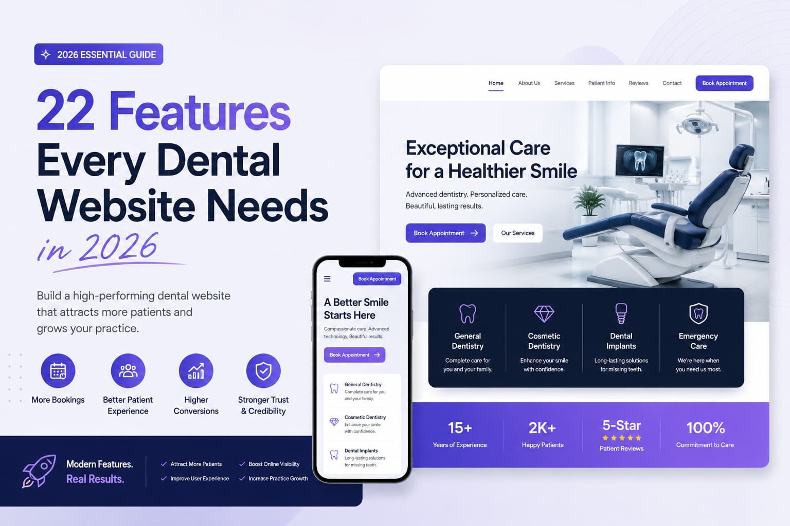
This checklist is for dentists and practice managers planning a new website or auditing an existing one, who want a clear, ranked list of the features that actually bring in new patients.
Every dental website needs click-to-call and online booking, visible Google reviews, credentials shown in plain language, real photos of the team and office, a dedicated page for each service, clear insurance and financing information, and a fast, mobile-first design. Features that reduce patient anxiety, like a doctor intro video and a “nervous patients welcome” section, convert the people other practices lose without ever knowing it.
The full list below covers 34 features, each ranked Must Have, Should Have, or Nice to Have based on how much it affects whether a visitor becomes a booked new patient. Not every feature earns the same investment, and knowing the difference keeps you from spending on polish while your phone number sits three scrolls down.
How to Use This Checklist
Work top to bottom, since the priority tags tell you what to fix first. Must Have directly affects whether a visitor books or leaves, so start there. Should Have meaningfully improves trust, comfort, or conversion, and comes next. Nice to Have polishes a site that’s already strong, worth doing once the basics are handled. If your budget runs out halfway through, you’ll still have everything that actually matters.
First-Impression Essentials (Above the Fold)
This is what a patient sees before scrolling, the digital version of a handshake. For a dental practice it needs clarity and warmth at once, because you may be greeting someone who’s nervous just being there.
- Click-to-call phone number, Must Have. Visible and tappable on every page. Many patients are on a phone and ready to act, so one tap to dial is essential.
- Book Online button, Must Have. A clear scheduling action next to the phone number, so patients can choose how to reach you.
- Warm, specific headline, Must Have. Name your practice type, city, and welcome, for example “Gentle Family & Cosmetic Dentistry in [City], New Patients Welcome,” not “Quality Dental Care.”
- Real team or office hero photo, Must Have. Your actual office, not a stock smile. Authenticity reassures nervous visitors instantly.
- Visible Google star rating, Must Have. Reviews drive the decision, so show your rating up front where it builds trust immediately.
- Doctor or office intro video, Should Have. A 60 to 90 second welcome from the dentist meaningfully lifts conversion by letting anxious patients see your manner before they commit.
- Emergency or same-day note, Should Have. If you offer it, say so above the fold. It captures your highest-urgency visitors before they leave to check elsewhere.
Trust & Credibility Features
Patients are deciding whether to trust you with their body, which takes deeper proof than most local businesses need. Nearly all patients read reviews first, and a growing share won’t contact a practice rated below 4.5 stars.
- Visible reviews and testimonials, Must Have. Show your Google rating and real patient stories on the homepage and service pages, not buried on a tab.
- Credentials in plain language, Must Have. List your DDS/DMD, years in practice, and memberships like the ADA, translated into what they mean for the patient.
- Real photos throughout, Must Have. Genuine team, office, and front-desk photos. Stock imagery quietly erodes trust in healthcare.
- Technology and safety signals, Should Have. Mention your equipment, comfort amenities, and sterilization standards. It answers a question patients are often too polite to ask out loud.
- Awards and associations, Nice to Have. Recognitions and memberships add a further layer of credibility once the basics are covered.
Anxiety-Reducing Features
This is the section most dental sites skip, and it’s the one that wins the nervous patient nobody else could. Fear keeps a meaningful share of people away from care entirely, so a site that actively calms it has a real edge.
- A “nervous patients welcome” section, Should Have. Directly acknowledging dental anxiety and explaining how you make visits comfortable invites the exact patients other practices scare off.
- Sedation and comfort options, Should Have. Clearly explaining sedation, breaks during treatment, and your gentle approach reassures fearful patients before they book.
- “What to expect at your first visit” content, Should Have. Demystifying the visit reduces fear of the unknown, the main driver of dental anxiety.
- Office tour video or photo walkthrough, Nice to Have. Letting patients see your calm, clean space beforehand lowers anxiety and no-shows.
Service Pages That Convert
A single catch-all Services page is weak for patients and for SEO alike. Each major treatment deserves its own page, better for the visitor, and each one can rank on its own.
- A dedicated page per service, Must Have. Separate pages for general, cosmetic, Invisalign, implants, emergency, pediatric, and sedation dentistry. “Dental implants in [city]” ranks far better with its own substantive page.
- Patient-education content on each page, Should Have. Explaining each procedure in plain terms, and how you keep it comfortable, builds trust while it informs.
- Before-and-after smile gallery, Should Have. On cosmetic and implant pages especially, real transformations are proof advertising can’t replicate.
- Video testimonials, Nice to Have. Few things convert a hesitant cosmetic patient like watching someone genuinely happy with their new smile.
Insurance, Cost & New-Patient Features
Cost and coverage anxiety stops a meaningful number of people from booking, so answering the money question openly is a major conversion lever, not an afterthought.
- Insurance accepted, clearly listed, Must Have. “Do you take my insurance?” is one of the first questions patients ask. Answer it before they have to.
- Financing options, Should Have. CareCredit, in-house plans, or similar. Removing the “can I afford this?” wall turns hesitation into a booked consult.
- Membership plan for the uninsured, Should Have. Patients on membership plans tend to visit more often and accept more treatment than uninsured patients without one, which is good for them and for the practice.
- New-patient special, Should Have. A clear, honest offer (exam, X-rays, cleaning at a set price) lowers the barrier for someone choosing between you and the practice down the street.
Booking & Scheduling Features
You’ve earned the trust, so don’t lose the patient at the finish line. Patients increasingly expect to book on their own time, and a growing share now expect scheduling and reminders by text rather than a phone call.
- Real online booking, Must Have. Let someone grab a slot at 10 p.m. without waiting for the office to open. This alone recovers appointments you’d otherwise lose.
- Short request forms, Should Have. Name, phone, email, reason for visit, preferred time. Collect the rest at check-in.
- Booking options in multiple places, Should Have. Hero, service pages, sticky header, footer, so no one ever has to hunt for how to become a patient.
- Text/SMS scheduling and reminders, Nice to Have. Meets the growing expectation for text-based communication and reduces no-shows.
Local SEO & Discovery Features
A beautiful site no one finds can’t fill the schedule. These features help new patients discover you when they search “dentist near me.”
- Google Business Profile alignment, Must Have. A complete, accurate profile with matching name, address, and phone. It’s where patients look first, and a top source of new-patient traffic.
- Local keywords and city relevance, Should Have. Naming your service areas helps you appear for “[service] in [city]” searches.
- Dentist / LocalBusiness schema markup, Should Have. Structured data that helps search engines and AI assistants understand and surface your practice.
- FAQ schema, Nice to Have. Marking up your FAQ section helps you appear in featured snippets and AI answers.
Performance Essentials
The best features don’t matter if the page won’t load. These are invisible when they work and costly when they don’t.
- Mobile-first responsive design, Must Have. Most “dentist near me” searches happen on a phone. A poor mobile experience quietly bleeds bookings.
- Fast load times, Must Have. Every extra second costs conversions and drags down your Google ranking. Compress images and cut unnecessary bloat.
Applying This to Your Own Site
[NEEDS REAL DATA: this section should walk through an actual homepage audit, with the client’s permission, once a real practice example and real before-and-after details are available. Don’t publish a placeholder or invented audit table here.]
The pattern worth remembering either way: the features that get missed are rarely the fancy ones. They’re the basics a patient checks in the first few seconds, a tappable number, a visible rating, a real photo instead of a stock one.