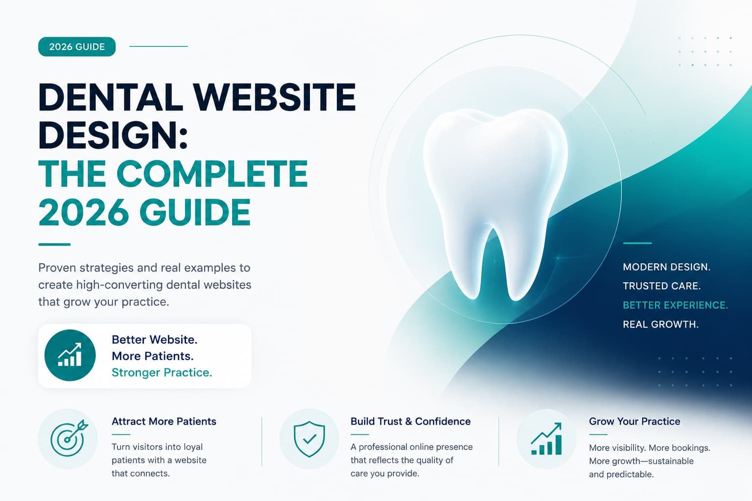
This guide is for dentists and practice owners who want their website to actually bring in new patients, not just look nice. If your site gets visitors but the schedule still has gaps, this is where to start.
Good dental website design means treating the site as a patient’s first consultation, not a brochure: a warm, specific first impression, visible reviews and credentials, content that actively calms dental anxiety, a clear answer to the insurance question, and booking that takes seconds instead of a phone call. Get those five things right and the same traffic you already have will produce noticeably more new patients.
Here’s something that surprises a lot of practice owners: the problem is almost never demand. Americans spend a substantial amount on dental care every year, a real share of working-age adults have untreated decay, and plenty of practices report they have room in their schedule for more patients than they’re currently seeing. The patients are out there. The constraint isn’t finding them, it’s capturing them.
That capture now happens online, before your phone ever rings. A prospective patient searches “dentist near me,” scans the reviews, clicks through to a website or two, and decides, often within a few minutes, who feels trustworthy enough to call.
There’s one more factor that makes dental websites different from every other local business, and most practices underestimate it: fear. Dental anxiety is common and well documented, and even patients who wouldn’t call themselves anxious often feel some unease about going. That means your website isn’t just competing on services and price. It’s quietly working to lower a stranger’s guard enough that they’re willing to book. Get that right and you’ll win patients that flashier, colder sites lose.
Your Website Is Your First Consultation
A dental website’s real job is answering a nervous stranger’s questions before they ask them out loud, not describing your practice. A few years ago, finding a dentist meant asking a friend. Today the journey begins, and often ends, with a Google search. Whether someone needs a routine cleaning, a cosmetic consult, or an emergency appointment, their first interaction with your practice usually happens on a screen. They research reviews, compare websites, and increasingly ask an AI assistant for a recommendation, all before they dial.
The questions running through that stranger’s head are consistent: Is this practice legitimate and experienced? Will they be gentle with me? Do they take my insurance? Can I get in soon, and can I book without a phone call? The practices that align their website with those questions consistently outgrow the ones relying on word-of-mouth or a bigger ad budget. Reputation is close to the whole marketing strategy in dentistry now, and everything below is about building a website that earns it at first glance.
Above the Fold: Reassure, Don’t Dazzle
The top of your homepage, what a visitor sees before scrolling, is your handshake. For most local businesses the goal is clarity. For a dental practice, it’s clarity plus warmth, because you’re greeting someone who may be nervous just being there.
Skip the sterile stock photo of gleaming teeth and the generic “Quality Dental Care” headline. Lead instead with something specific and human: who you serve, where you are, and a tone that feels welcoming. “Gentle Family & Cosmetic Dentistry in [City], Now Welcoming New Patients” does more work than any polished tagline, because it signals warmth, names the location, and invites the exact person you want.
A strong dental hero section includes a warm, specific headline naming your practice type and city, a real photo of your actual team or office that’s calm and human, a clear “Request an Appointment” or “Book Online” button alongside a visible, tappable phone number, a visible Google star rating, and, if you offer it, a note about emergency or same-day appointments.
One more addition is worth calling out specifically: a short doctor introduction video, 60 to 90 seconds, right on the homepage. Practices that embed a warm intro video, who you are, your philosophy, why you became a dentist, tend to see meaningfully better conversion from visitor to booked appointment, because it lets an anxious patient see your face and manner before they commit.
Build Trust Fast, Because This Is Healthcare
Trust has to be built faster and deeper on a dental site than almost anywhere else, since you’re asking someone to let you put instruments in their mouth. That’s a level of vulnerability no HVAC or landscaping customer ever faces. Nearly all patients read online reviews before choosing a dentist, and a growing share won’t even contact a practice rated below 4.5 stars. Trust isn’t a section on your site. It’s the whole job.
Real photos, never stock, do a lot of that work. Patients can spot a stock smile instantly, and it quietly erodes credibility. Show your genuine team, your real office, your front desk. Familiarity is reassurance.
Credentials matter too, but only in plain language. List your DDS/DMD, years in practice, continuing education, and memberships like the ADA, but translate them into something a patient understands. A dentist with real, specific experience in implants or cosmetic work should say so directly rather than let a row of credentials speak for itself.
Put reviews and testimonials everywhere, not just on a Testimonials tab. Your Google rating and real patient testimonials belong on the homepage and on individual service pages. Specific stories (“I hadn’t been to a dentist in years because of fear, and they completely put me at ease”) persuade far more than a generic five-star line, and Google is where patients look first, so keep those reviews visible and current.
Signals of a modern, clean practice help close the loop. Patients are often quietly checking whether an office looks clean and well run, so reassure them ahead of time: mention your technology, comfort amenities, and safety standards. It answers a question they’re often too polite to ask out loud.
Reduce Dental Anxiety on Purpose
This is the section most dental websites skip, and it’s the one that separates a practice that merely lists services from one that wins the nervous patient nobody else could. Anxiety keeps people away from care, sometimes for years, so a website that actively defuses fear has a real competitive edge.
Video does a lot of the heavy lifting here. Beyond the doctor intro, short clips, a friendly office tour, a hygienist explaining what a cleaning actually feels like, a “what to expect at your first visit” walkthrough, let anxious patients experience your office before they step inside. Practices that invest in this kind of video tend to see fewer first-visit no-shows and better acceptance of bigger procedures, because patients arrive already familiar and less afraid.
Address the fear directly, too. A simple “Nervous about the dentist? You’re not alone, here’s how we make visits comfortable” page or section signals empathy and invites the very patients other practices scare off. Mention sedation options, breaks during treatment, and your gentle approach.
Meet the team matters more than it sounds. Faces, names, and short bios turn a faceless clinic into people. When a patient feels they already “know” the hygienist, the visit feels safer before it even starts.
And let the design itself breathe. Calm colors, generous spacing, warm imagery, and plain language all lower the temperature. A cluttered, clinical, hard-to-read site raises anxiety before a word is even read.
Dedicated Service Pages
A single catch-all Services page is one of the most common and costly mistakes in dental web design. It’s weak for patients, who have to hunt, and weak for SEO, because Google can’t rank one page for a dozen different treatments.
Give each major service its own page with real, patient-friendly content: general and family dentistry, cosmetic dentistry (veneers, whitening), Invisalign or clear aligners, dental implants, crowns, bridges and restorative care, emergency dentistry, pediatric dentistry, and sedation or comfort dentistry.
Each dedicated page can rank on its own. “Dental implants in [city]” performs far better with a substantive implant page than with implants crammed into a shared paragraph. Just as importantly, each page is a chance to educate and reassure: explain the procedure in plain terms, what to expect, and how you keep it comfortable.
For cosmetic and implant pages especially, add a before-and-after gallery. Cosmetic dentistry is a visual, emotional purchase, and real smile transformations are proof advertising can never replicate. Pair a few with video testimonials where you can. Watching someone genuinely thrilled with their new smile is one of the most convincing things you can show a hesitant cosmetic patient.
Remove the Insurance and Cost Barrier
Ask any front desk what prospective patients ask first, and “do you take my insurance?” will be near the top. Cost and coverage anxiety stops a real number of people from booking, so practices that address it openly on the website win patients who bounced off vaguer competitors.
On a clearly linked page, make the money question easy. List the insurance plans you accept, plainly, and if you’re out-of-network, explain how you still help patients maximize their benefits. Spell out financing options, CareCredit, in-house payment plans, whatever you offer, since removing the “can I afford this?” wall turns hesitation into a booked consult. Offer a membership plan for the uninsured if you can, since patients on membership plans tend to visit more often and accept more treatment than uninsured patients without one, which is good for them and good for the practice. And consider a new-patient special: a clear, honest offer like an exam, X-rays, and a cleaning at a set price lowers the barrier for someone choosing between you and the practice down the street.
Transparency here isn’t just kind. It filters for ready patients and reduces awkward money conversations later.
Make Booking Effortless
You’ve earned the trust and answered the questions. Don’t lose the patient at the finish line by making them jump through hoops. Patients increasingly expect to book on their own schedule, often outside office hours, and a growing share expect appointment scheduling and reminders by text or online rather than a phone call.
Add real online booking so someone can grab a slot at 10 p.m. without waiting for the office to open. This alone recovers appointments you’re currently losing. Keep request forms short, name, phone, email, reason for visit, preferred time is plenty, and collect the rest at check-in. Make the phone number tappable on every page for patients who’d rather call, and put a booking option in multiple places, hero, service pages, sticky header, footer, so no one ever has to search for how to become a patient.
Every extra click between “I’m ready” and “I’m booked” is a chance for a nervous patient to talk themselves out of it. Remove them.
Mobile and Speed
Most “dentist near me” searches happen on a phone, frequently from someone in discomfort or squeezing the search between other things. If your site is slow to load or awkward to use on mobile, you lose them, and a slow site also drags down your Google ranking, so you lose twice.
Your mobile experience should make it effortless to read about a service, see your reviews, tap to call, and book, with large buttons, fast load times, and no pinching or zooming required. Compress your images, since dental sites are often photo-heavy, cut anything that bloats the page, and test on an actual phone over cellular data, not just your office WiFi.
The Local SEO Foundation
A beautiful website that no one finds can’t fill your schedule. Local search is how new patients discover you, so the design has to sit on a solid local SEO foundation: an optimized Google Business Profile that’s complete and accurate, with your primary category set to Dentist or your specialty, regular photos, and every field filled; a steady review system built from a simple habit of asking every satisfied patient, ideally right after a positive visit; service-area and city relevance so you show up for “[service] in [city]” searches; and LocalBusiness or Dentist schema markup to help search engines and AI assistants understand and surface your practice.
This is a whole discipline of its own, but a well-designed site with these fundamentals baked in gives you the foundation to actually rank and grow.
Common Mistakes to Avoid
- Stock photos of models. They read as fake and undercut trust in a field where trust is everything.
- A single Services page. Weak for patients and for SEO. Give each treatment its own page.
- Hiding insurance and cost info. The unanswered money question sends patients to a competitor who answered it.
- No online booking. You’re losing after-hours patients to practices that made it easy.
- A cold, clinical design. For anxious patients, sterile equals stressful. Warmth converts.
- Burying your reviews and phone number. Put your proof and your contact info where nervous visitors can see them instantly.
- Ignoring mobile. Most patients are on a phone, so a poor mobile experience quietly bleeds bookings.